New Healthy Cities book showcases spatial health research, including sDNA

Healthy Cities: Public Health through Urban Planning (Chinmoy Sarkar, Chris Webster & John Gallacher) describes a novel approach to public health and healthy-city planning that integrates the diverse and multi-level health determinants present in a city system.  sDNA gets its own chapter.

From the description…

Mounting scientific evidence generated over the past decade highlights the significant role of our cities’ built environments in shaping our health and well-being. [...]

The authors trace the origins of public health and city planning, drawing upon the shifting paradigms of epidemiology. Advanced network analysis techniques are employed to examine multi-scale associations between individual-level health outcomes and built environment features such as density, land-use mix and road network configuration.

Healthy Cities will prove a fascinating read for an interdisciplinary body of scholars, practitioners and policy makers within the domains of public policy, regional and urban studies, urban planning, spatial epidemiology, health geography, sociology, public health and psychology.

Footprinting the Hay Festival

Map

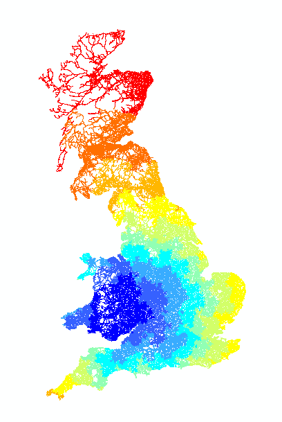
Map of distances associated with shortest-time road travel routes to Hay-on-Wye

sDNA was behind a large part of the scenario modelling in a recent report on the ecological footprint of the Hay literature festival.  Crispin Cooper (of the sDNA team) and Andrea Collins (Planning & Geography) presented the results at the festival itself.

How was sDNA used in the study?  Relatively simply – we produced a map of road travel distances to Hay from all locations across the UK to feed into further analysis.  Using angular analysis, we were able to proxy shortest-time rather than shortest-distance routes based on minimal data – i.e. calculating travel distances assuming people take the motorway rather than small lanes, when available.  All of this is possible without the need to pay for travel time data.

The facility to output a map like this is part of the feature set of the upcoming sDNA version 2.  Currently this is only available to our research partners, though we are open to forming new partnerships so do get in touch if you are interested.  For those of you who already have access – you would produce a map like this by making use of the outputdestinations keyword in advanced config.  If you don’t want to be overwhelmed by data, you would also need to restrict your output to a single origin using origin=511326 where (in this case) 511326 was the object id for the link where the Hay festival is situated.

Predicting community cohesion

What happens when we finally take a break from writing software to do some research with it?  This – a novel finding on spatial network layout and community cohesion published in the International Journal of Health Geographics.  Some figures are pasted below.

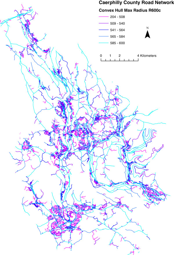
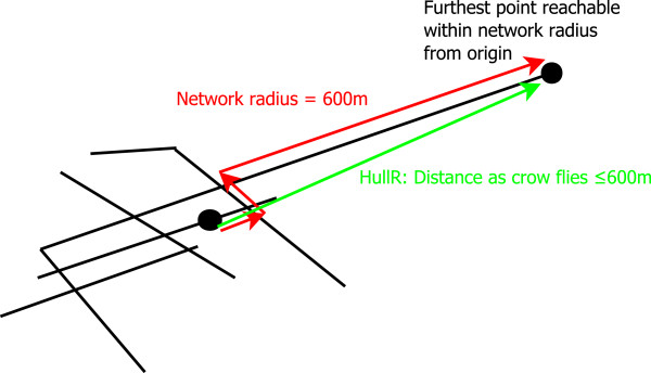
The key result is that Convex Hull Maximum Radius 600m (HullR600c) had a significant correlation with community cohesion (R=0.25). This worked on two study areas (a data mining and separate test data set); we controlled for deprivation and urban/rural status as well. Areas with higher HullR600c allow you to get further for the same walking distance – so we suspect this is an important aspect of walkability.

A word of warning, though: this applies to HullR600c averaged over areas rather than on individual street level. On individual streets, long straight roads will have the highest HullR600 – and these are typically through transit routes with little habitation let alone community cohesion. The reason this works at area level is that we average over network links, not road length – and we know that links correlate with interesting human activity such as homes and jobs. So these anomalies are ‘weighted out’ of the analysis.

Convex hull max radius (600m) for Caerphilly County Borough road network

OS ITN mapping © Crown Copyright/database right 2013. An Ordnance Survey/EDINA supplied service.

Illustration of convex hull maximum radius

Visit from cabinet minister

Francis Maude visits sDNAsDNA attracted the attention of Cabinet Office Minister Francis Maude on a visit to the university this week.

 ”It is great to see the fascinating work that Cardiff University is doing to create efficient cities that best serve their communities [...].  I’m interested in how analysis from initiatives like Cardiff University’s sDNA tool could help my officials examine how our plans will shape the local environment in the future.”

See the cabinet office press release here and the university one here.

sDNA wins iSolve 2013

A team of students with a project based on the sDNA software won the Winter 2013 iSolve competition. This is a scheme that allows entrepreneurial postgraduates and researchers to work with real inventions in order to determine the best route for their commercialisation.  Congratulations to all involved!

More information here

Predicting GDP with spatial network analysis

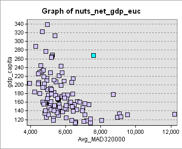
Here’s an interesting little plot I thought I’d share.  It shows Mean Angular Distance (MAD 320km scale) on the x axis and GDP per capita on the y.  High MAD means less accessible, so the plot shows a trend where less accessibility is associated with less productivity.
graph

The blue outlier is Aberdeen, by the way – rich in oil income but situated in the back of beyond.  And London is a long way off the chart to the top left.

Interestingly, MAD measures only accessibility of spatial networks rather than raw quantity.  You might think raw network quantity (highly correlated with population and jobs, r2>0.9) would be a better predictor of GDP than accessibility.  Maybe it is, if you get the scale of measurement right (accessibility on a large scale could be a proxy for quantity on a small scale).  But for the range of scales I tested (10,20,40,80,160,320,640km) it wasn’t.

Anyway this is just interested tinkering, rather than a serious piece of research.  More importantly it was a test of a truly large scale network analysis with the upcoming sDNA version 2.  We saved computation time by only computing accessibility for a sample of points in each region (sDNA will have the capacity to do this); in fact the whole computation took less time than it took to load and save the data, which for a million-link feature class is quite substantial.  The whole job was done in an hour or two.

UPDATE 30/10/2014

I followed this up with the new sDNA+, making a model with population assigned to the network.  It was tested for many more radii: 5, 10, 15, 20, 25, 30, 40, 50, 60, 70, 80, 100, 120, 140, 160, 180, 200, 240, 280, 320, 360 and 400 km; in each NUTS region I sampled 20 points on the network to compute accessibility on these scales.

It turns out by far the best predictor was plain ol’ population (Weight, within sDNA – when you have assigned population data to network weight).  Population within a 10km network buffer has r=0.7 with GDP per capita.  This beat network gravity models formed with the MAD, MED, NQPDA and NQPDE accessibility stats.

Computing accessibility on all those scales, for 20 points in each of 113 regions, ran overnight on my Core i3 (not too fast) processor.  I skipped the more expensive sDNA computations by putting nobetweenness;nojunctions;nohull into the advanced config.  In fact, I might as well paste the whole advanced config for this analysis here:

nobetweenness;nojunctions;nohull;skipzeroweightorigins;origweight=compute;destweight=link_population

Compute was a field I set to 1 for links I wanted to compute accessibility for; 0 otherwise.  I chose these at random with a probability inversely proportional to the number of links in each region.

Measuring access to natural recreational space

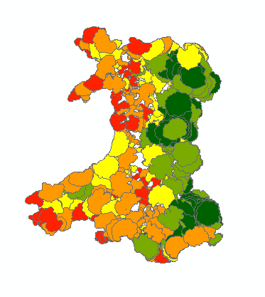
Here are some images from some work we did for the Department of Public Health.  The first is a buffer analysis of access to footpaths, bridleways etc for each output area in Wales.  The buffers shown on the map are centered on OA centroids; designed to indicate the area accessible by driving 13km (on a road obviously) then walking 2km (as the crow flies – sadly nobody seems to have a definitive source of network data for rural paths).  The colouring shows access to public rights of way.

Map of sheeplike shapes

Network+Euclidean buffers around Output Area centroids in Wales, coloured to show access to footpaths and bridleways (green is more)

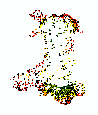
Somehow the shapes produced remind me of sheep, which is nice, but before anyone gets too parochial about that I should point out that most other countries would look the same.  As you can see, it’s the border with England that seems to have the best access to countryside; but that’s because the above map misses off the open space across which we are lucky enough to be able to wander freely.  So here’s the open space (this time ditching the sheep shapes and plotting access in the centre of LSOAs for legibility):

Map of points

Access to open space within 13km buffers (green is more)

Now we see the truth of it – the backbone of Wales has an enormous amount of publicly accessible green space.  The people who miss out, on these measures, are the residents of Carmarthenshire which doesn’t seem to do well on either open space or rights of way.  (There is also the edge effect induced by the coastline – obviously people living by the sea have less land accessible to them – but then the coastline is nice feature in itself).  Anyway, all this is now being studied for its impacts on mental health.

What did sDNA do here and how can you do it?  It uses features of the upcoming sDNA version 2; namely (in advanced config) outputnetbuffers to produce the network buffers which are then processed to make the sheep shapes.  Also skiporiginifzero to restrict our production of buffers to the OA centroids we are measuring.  Of course, ArcGIS network analyst can do this – in theory!  In practice, it crashed when presented with such a large analysis, but sDNA didn’t.